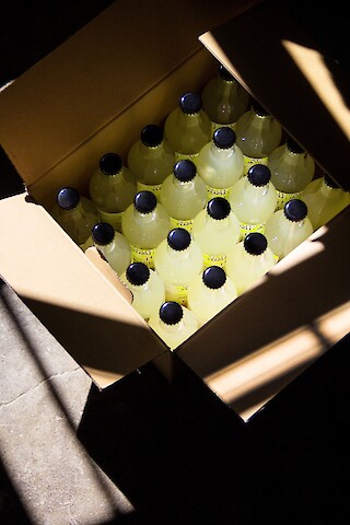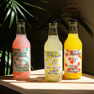
The Urban Lemonade team places great importance on quality. Based on products such as Yuzu lemonade, their drinks are free of artificial aromas and colours and result from successful experiments with unknown fruits and flavours. Perfectly encapsulating the design philosophy of Jalscha Römer and Kevin Högger, a strong basic idea enriched with exciting details meets clear expression and clean implementation.
The first Urban Lemonade was created by the restaurateur Urban Högger, Kevin’s uncle, for an exhibition about Japan. The drink proved very popular, so after the exhibition ended, Kevin and Jalscha redesigned the label, developed two further flavours and finally founded a company together with Urban. The lemonades have a high fruit content, deliberately contain little sugar and are bottled in Switzerland.
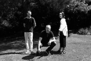
The team has been supported by Mathis Neuhaus (text), Tobias Siebrecht (still life photography), Aline Rüede / Studio Végété (floral design campaign) and Mischa Schlegel (photography campaign).
«Our objective as designers is to create an all-round high-quality product – from bottle content to the bottle itself, and from our corporate identity to social media campaigns.»
It seems as if there are hundreds, maybe thousands of lemonades with the most unusual flavours, all of which compete for a limited number of customers. How do you set yourselves apart?
By focusing on every detail, and specifically also on the packaging. The label on the bottle needs to be compelling to appeal to those who have never heard of Calamansi or Cocoa Sirsak. The vibrant colours and modern look help a great deal to position the drink as high-quality and attractive in people’s perception, so they want to reach for it in the drinks section.
Talking about the label – I believe there’s an interesting story behind it …
That’s right. The first label was put together by Urban Högger on his own, using Powerpoint, and we actually quite liked this initial version. When we redesigned it, we focused above all on achieving a high-quality impression both in terms of the drink and the brand. The reduced level of typography contrasts with the playful bubbles, and the three different flavours perfectly lend themselves to a serial approach.
How do you communicate with your customers, apart from through the actual product itself?
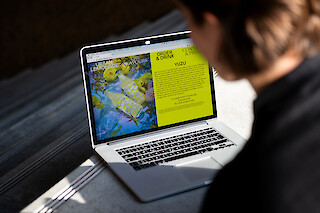
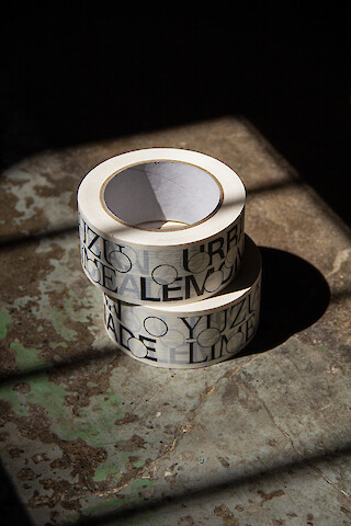
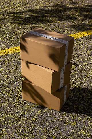
In addition to the label, we have also designed the entire corporate identity and the website, and we handle the art direction for our image and video campaigns. It is important to us that Urban Lemonade does not reproduce any stereotypical themes: unsubtle or tired images of beads of water or exotic palm fronds are taboo. In our campaigns we also like to work together with selected photographers and stylists. As a result, our lemonades have been showcased in perfectly lit flower landscapes or on walks with friends.
CHF 3.90.-
